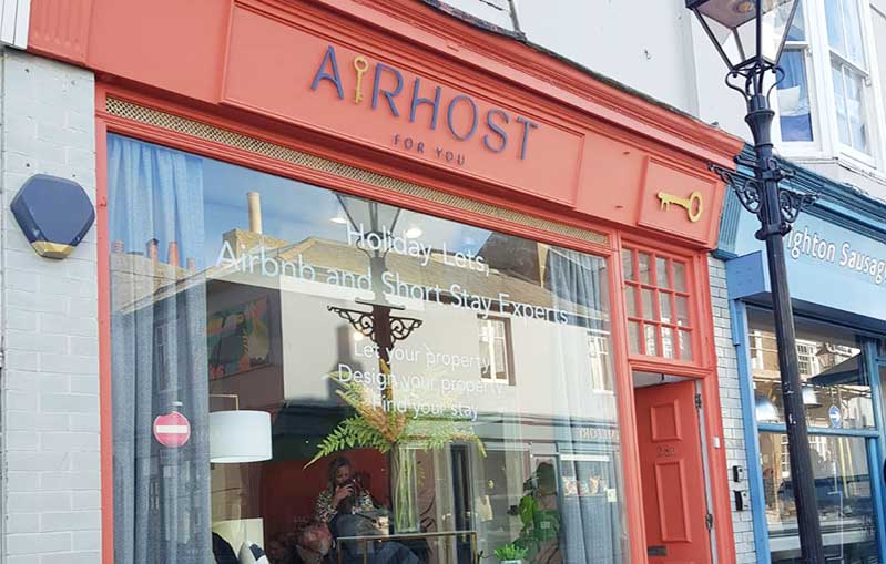
5 good tips for business signage design
Business signage design is a powerful marketing weapon. At The Sussex Sign Company, we’ll design the best signs for your small business.
Business signage is a cost-effective way to make your business stand out. And these simple but effective design tips can help your signs command attention. Of course, there’s no one-size-fits-all solution, but these are the five areas to focus on to make your signs a success.
Create contrast to catch the eye
If you want a sign that’s vibrant, easy to read and highly visible, creating contrast is key. Monochrome can be effective, but the use of a high-contrast colour combination such as black on yellow ensures proven readability.
One word of caution – always keep colour use consistent across your branding. And be sure to test your combinations in a real-life setting to ensure your signs don’t disappear into the background.
Keep it simple
It’s the gold standard of great business signage design. Keeping your business signage simple has more impact than a cluttered sign that’s just so much visual noise. Copy that has an impact matched with attention-grabbing visuals is a time-tested way to create slick and arresting signage.
And don’t be afraid of white space. Used well, it directs the eye onto your key messaging for better effect.
Big, bold fonts
Don’t be tempted to use elaborate fancy fonts for your business signage. They may draw the eye on a business card, but they can be hard to read at a distance.
San serif fonts are crisp and bold for maximum impact. They’re easy to read and should always be your first choice for key messaging. Fonts such as Arial and Garamond are good options for body copy and can be used to highlight your signature display fonts.
High-definition graphics
A great graphic will grab the attention of passers-by, and it doesn’t need to be complicated. A photo or logo is usually enough to give your signage the edge.
Choose high-definition graphics for maximum impact and match the graphics to the message and overall design. Poor-quality graphics send the message that your brand doesn’t put enough thought into signage design.
Location, location, location
The location of your signs will impact everything from the substrate you use to the design elements required. For example, if you’re competing on a busy high street, think of bold colours and eye-catching design elements.
If you’re ordering outdoor signage, be aware of sizing. The general rule of thumb is one inch of height for every 10 feet of extra distance. So if you want your sign to be seen from 200 feet away, your lettering will need to be at least 20 inches tall. In turn, this will affect the overall size of your signs.
The Sussex Sign Company, your business signage professionals
If you’re looking to optimise your ROI, talk to us. As business signage professionals, we can help you create the best signs for your brand. So if you’re looking to showcase your business, please get in touch today!

