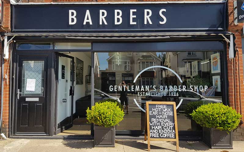
Signage is a great way to increase brand visibility – read on to find out more.
Visibility is one of the most important aspects of your outdoor signage. So optimising your signs for brand visibility is a clear winner. If you’re based in East or West Sussex, we can help design, manufacture and install your signs but here are our top five tips for optimisation and visibility.
1. Location is key to your brand
A great first step to optimising visibility is placement and sightlines. First, avoid areas with obvious obstacles such as tree branches and other buildings. Then make sure your sightlines are clear and unobstructed for maximum visibility.
We can help you position your signs for greater impact, inside and outside your building.
2. Size matters
In addition to location, size matters. Start by working out how far from your signs viewers are likely to be. As a rule of thumb, each inch of height adds another ten feet of visibility to your sign.
For example, if you want your signs to be seen from 50 feet away then each letter needs to be 5 inches tall. Conversely, if your signs are going to be seen close up, make sure they’re in the correct scale so they don’t feel overwhelming.

3. Choose durable materials
Getting the size and placement right will give your sign visibility. But you also need to think about durability. After all, if you don’t use the right materials, your signage could fail fast, taking your investment with it.
Good sign material is durable and weather resistant, able to stand up to anything. In turn, that means your messaging is visible for longer. For example, if you need safety signs, you might opt for a reflective material that means they’re highly noticeable at all times.
4. Colour contrast
Creating the greatest contrast between the lettering on your sign and the background is another sure-fire tip for creating highly visible signs. Popular combinations include black and white, yellow and black and white on blue. Basically, you should aim for dark copy on a light background or vice versa.
If your logo or branding doesn’t already have good contrast, it’s worth adjusting the colours you use. For example, if your sign will be mounted on a neutral building, try and avoid medium tones. Or use a sign backing that makes the signwriting stand out.
5. Focus on your brand’s fonts
You may already have a set of fonts associated with your brand. But be aware that the weight of your font can have a big impact on legibility and visibility – too thin and the letters will be difficult to make out, too wide and they’ll tend to blur into one.
If you use script fonts, keep them to a minimum. Ensure important information is clearly marked in a sans serif font. However, serif fonts can give your signage gravitas, so if you’re looking to make a professional impact, try a more traditional font.
Signage for your Sussex based business
Making sure your signage is optimised for visibility can seem daunting, but at The Sussex Sign Company, we’re here to help. Please get in touch today to find out how we can boost your brand.

