Signage is a great way to make sure your venue is Insta-worthy if you follow these tips for creating stand-out signs
The more visually appealing your venue is, the more guests it attracts. In the Instagram age, your East Sussex hotel or wedding venue needs to pull out all the stops to create the moments your guests will love. And if they’re posting images of your lobby, bedrooms and public spaces then the chances are they’re taking pics of your signage.
Paying attention to your signs might not seem an obvious choice when you’re making your venue Instagrammable. But they contribute to your guests’ overall experience, which means you need to take the time and effort to elevate them to the kind of visual art that pops on a screen.
Here’s what to think about when making your venue signs Insta-worthy.
Keep it minimal
Pick up on the boutique hotel vibe and strip your signs back to a chic and minimal design that says it all.
Gone are the days of blaring fonts and colours and screaming discount offers. Your guests expect a fully customised experience that isn’t trying to sell them something but to offer a unique experience.
Strip the design back so it conveys the essence of your brand and values. Your guests will appreciate being treated like adults and if you get the visuals right they’ll be happy to use your signage as a backdrop.
Find the right typography vibe
There are literally thousands of fonts to choose from. If you already have a strong visual image through your corporate branding then additional signs will need to remain consistent. If you’re aiming to incorporate new typefaces make sure they’re from the same family to create that seamless look.
If you’re starting from scratch then think about the size of the sign and the message you want to convey. Are you aiming for effortlessly contemporary or charmingly traditional? If readability is key, try a sans serif font.
Get cosy with colour
If your brand already has a recognisable colour palette, play with warm tones to create highly relatable signs that make your guests feel cosy and comfortable. In turn that encourages them to linger and feel relaxed.
Choosing your own colours? It’s worth looking at colour psychology but bear-in-mind that colour perception is highly individual. You also need to bear in mind the cultural connotations of the colours that you choose. For example, you may want to use green in your signs for its association with nature and wellbeing, but it’s regarded as an unlucky colour in Chinese culture.
Try and pick colours that align with the overall messaging of your brand and choose shades from the warmer end of the spectrum to create that cosy ambience. If you want to go for an effortless luxe look stick with stylish monochrome. Remember, you want your signs to add a visual pop that makes the perfect background and are totally Insta-worthy.
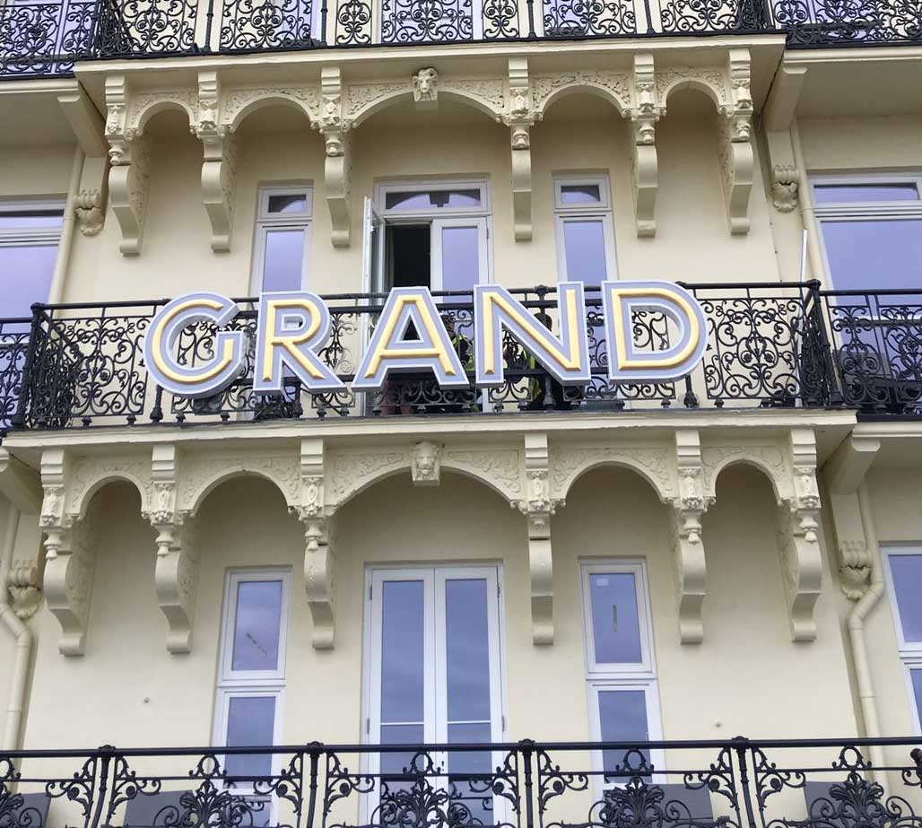
Stunning signage that’s always Insta-ready
At The Sussex Sign Company, we work with you to create signs that create a great visual impression. Get in touch with us today to find out how our signs can make your venue Insta-worthy.” Check out our Instagram or contact us through our enquiry form.