Why Green Isn’t Just Green: Choosing the Right Colour for Your Business Signage

When you say you want a green sign, that sounds fairly straightforward.
But which green?
Dark green, racing green, emerald, lime, forest, olive, mint or something completely different?
As we demonstrate in our video, even a single colour such as green can come in an enormous range of shades. Put several of them next to each other and the differences suddenly become very obvious.
For a business, choosing the right colour isn't simply about picking something that looks nice. Colour is an important part of your brand identity, and getting it right across your signs, vehicles and other branded materials can make a significant difference to how professional and consistent your business looks.
Why Is Colour So Important in Business Signage?
Think about some of the businesses and brands you see every day. In many cases, you can recognise them from their colours before you've even read their name.
That's the power of consistent branding.
Your signage is often one of the largest and most visible representations of your brand. It could be the fascia above your premises, an illuminated sign, a fleet of vans travelling around Sussex or graphics inside your reception.
If the colour on one doesn't match the colour on another, your branding can quickly start to look inconsistent.
That's why at The Sussex Sign Company we don't believe choosing a colour should simply involve someone saying:
"Make it green."
We want to understand which green.
How Many Different Shades of Green Are There?
Potentially thousands.
Even looking through a relatively small colour swatch demonstrates just how dramatically one shade can differ from the next.
A dark, traditional green can communicate something completely different from a bright lime green.
For example, a deeper green can work particularly well for a business wanting to communicate heritage, quality, tradition or an association with the countryside.
A brighter green might be chosen by a business wanting something that feels fresh, energetic, modern or highly visible.
Neither is necessarily right or wrong.
The important question is:
Which shade is right for your business?
Your Existing Brand Colours Should Be the Starting Point
If you already have an established corporate identity, we will normally start with your existing brand guidelines.
These may specify colours using systems or references such as:
- Pantone
- RAL
- CMYK
- RGB
- HEX references
- Specific vinyl or material colour references
This gives our design and production teams a defined colour to work towards rather than relying on somebody's interpretation of what "dark green", "bright blue" or "deep red" means.
If you don't have formal brand guidelines, don't worry. We can work with existing logos, printed material and examples of your current branding to help establish the most appropriate colour for your new signage.
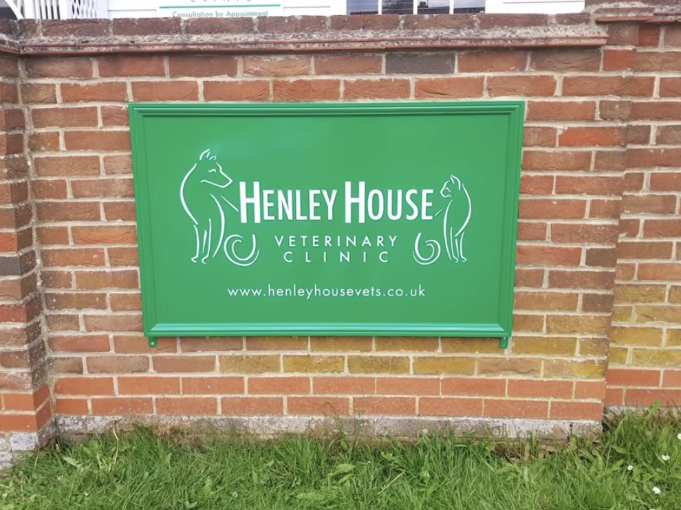
Why Can Colours Look Different on a Screen?
This is another issue we regularly encounter.
You might choose a colour from your computer monitor and then be surprised that it looks slightly different when it appears on a physical sign.
There are several reasons for this.
Computer monitors, tablets and phones display colours using light, whereas printed graphics and physical materials reflect light. Screens can also vary considerably depending on their brightness, colour settings and display technology.
This means the green you see on your laptop isn't necessarily an exact representation of the green that will appear on a printed vinyl graphic.
It's one of the reasons professional colour matching and physical colour swatches can be so useful.
Printed Colour vs Coloured Vinyl
Not every sign is produced in the same way.
Some signs and vehicle graphics are created using vinyl manufactured in a specific colour. Others are digitally printed, while many projects use a combination of different materials and production methods.
This can create another challenge.
Imagine your corporate green appearing across:
- External building signage
- Window graphics
- Vehicle graphics
- Internal wall graphics
- Printed display materials
- Illuminated signs
Those products could potentially involve several different substrates, vinyl’s and printing processes.
Our job as a signage company is to understand those differences and achieve the most consistent representation of your brand possible across the finished project.
What About Vehicle Graphics and Van Signwriting?
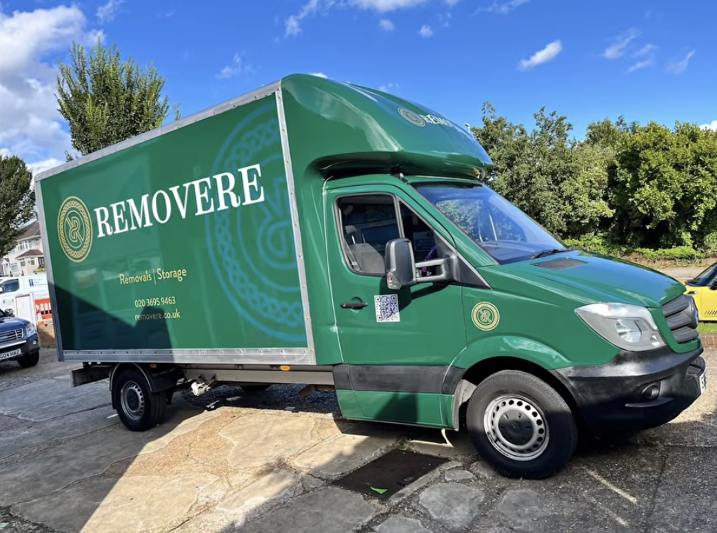
Colour consistency is particularly important when you're building a fleet of branded vehicles.
Your vans are moving advertisements for your business, and customers may see several of them in different locations.
If one vehicle is noticeably different from another, it can undermine the consistency you're trying to create.
Where we're producing ongoing vehicle graphics or fleet livery, keeping accurate records of the materials, colours and specifications used also helps us maintain consistency when additional vehicles are added later.
Can You Match an Existing Sign Colour?
In many cases, yes.
If you're replacing or adding to existing signage, we'll look at the original specification where it's available and assess the existing colour.
However, it's worth remembering that materials exposed to sunlight and weather for many years can change over time.
Trying to match a brand-new material to something that has been outside for ten years isn't always as simple as using the original colour reference.
That's where experience and physical colour comparison become particularly important.
Should I Choose My Sign Colour From a Computer Screen?
For initial design concepts, absolutely.
For a colour-critical project, however, we may recommend confirming the final colour against a physical colour swatch or sample.
If you've spent years developing your brand, it's worth spending a little extra time making sure the colour appearing above your building or across your vehicle fleet properly represents it.
What If I Don't Know Which Colour to Choose?
That's exactly where a good signage company should be able to help.
You don't need to understand colour systems, vinyl manufacturers or printing processes before contacting us.
Our design and production teams work with colour every day.
We can look at your logo, existing branding, premises, vehicles and the overall impression you're trying to create and help establish the most suitable approach.
Sometimes that might mean finding the closest possible match to an existing corporate colour.
Sometimes it means showing you several options and allowing you to see the difference for yourself.
As the video demonstrates, green really isn't just green.
Consistency Is the Key
Ultimately, choosing the right colour is about more than the individual sign.
It's about making sure customers see the same business wherever they encounter your brand.
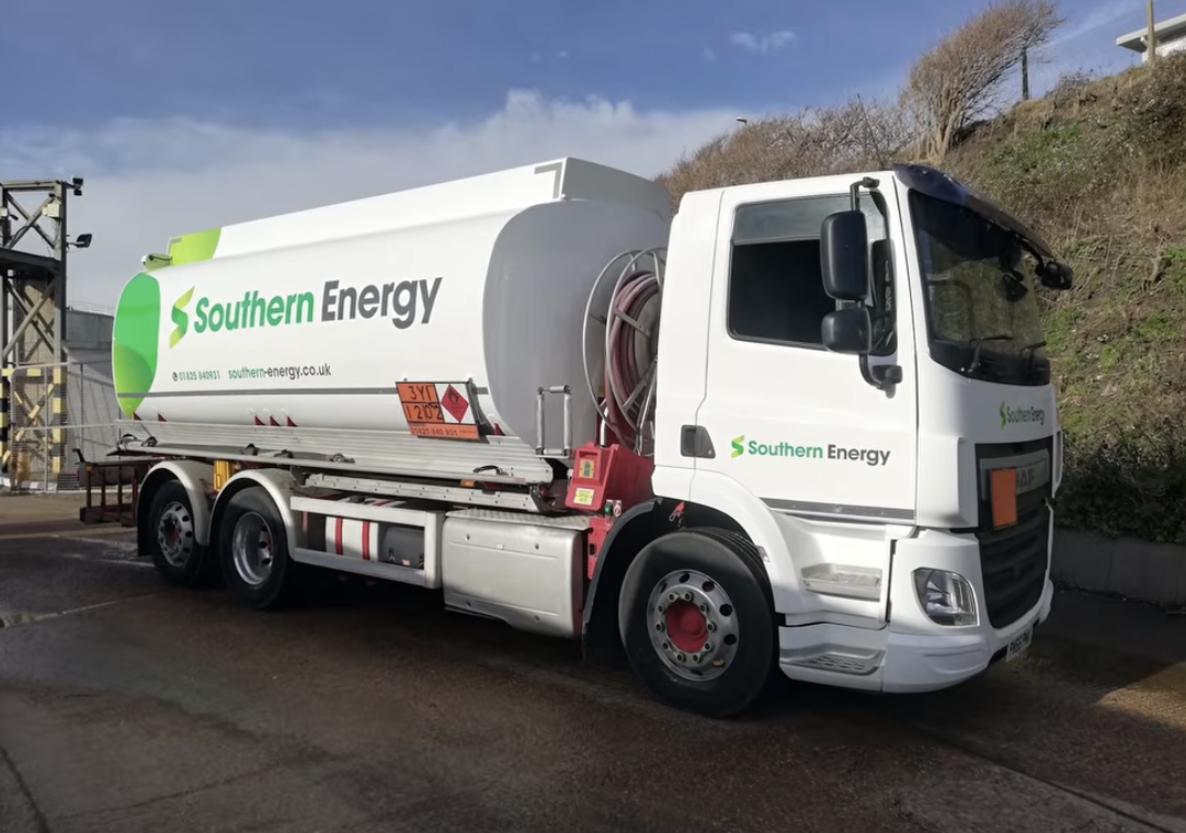
Your shopfront, office signage, reception, windows and vehicles should all feel as though they belong to the same company.
That consistency helps create a stronger, more professional and more recognisable brand.
Need Help Choosing the Right Colour for Your Signage?
If you're planning new business signage, vehicle graphics or a wider rebranding project, The Sussex Sign Company can help you choose materials and colours that work with your existing brand.
We've been designing, manufacturing and installing signage for businesses across Sussex and beyond since 1995.
Whether you know the exact Pantone reference you need or your brief is simply "we'd like it green", our team can help you take the next step.
Talk to The Sussex Sign Company about your next signage project and let us help you find the right colour for your business.”